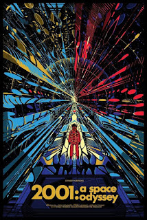
Friday 28 October 2016

Bill Plympton and Richard William animator review

Bill Plympton


American animator, Bill Plympton is known for his unique animation style and a large number of notable works such as ‘Your Face’ and ‘Guard Dog’. Born on 30th of April 1946, Plympton was raised on a farm before studying at Portland State University. From 1964 to 1968 he studied graphic design before transferring to School of Visual Arts in New York. Plympton graduated in 1969 majoring as a cartoonist.
From this point Plympton went on to create illustrations and cartoons for The New York Times and various other publications and magazines. While creating his own animations Plympton has also cooperated with other animators to create short films.
Choosing a far more traditional approach to animation Plympton use a range of more conventional tools and means to create his moving images. A large majority of his films will use pencil to convey the message. Despite being an incredibly difficult feat to pull off plympton has manage to create fluid animations filled with more bizarre scenes showing colour and depth. In collaboration with Parsons brown, Plympton created the animation ‘Mexican Standoff’ showing a number of distorted angles that have been well formed. Each frame has been lovingly created with each one being individual giving his artwork a unique twist.

Richard Williams


Born on the 19th of March 1933, Richard Williams is a Canadian-British animator who has also taken part in acting, directing animation and writing. During his early work Williams won a BAFTA for his animated film ‘The Little Island’. It was in the mid-1969s where he progressed creating a 1971 interpretation of ‘A Christmas Carol’ which one an Academy Award. Over the years Williams produced a number of work earning him an Emmy Award and 2 Oscars.

Probably more easily recognised with being in tone with more traditional forms of animation Williams has managed to interpret his work in many different ways with style varying from time to time. One thing that remains consistent throughout his work is the smooth animation between the frames and the level of depth given with great handling of shading. This is often combined with strong backgrounds and sets. 


Thursday 27 October 2016

La Belle et la Bête Film review

La Belle et la Bête Film review

Fig.1 Poster

Directed by Jean Cocteau, ‘La Belle et la Bête’ is a 1946 French film that takes upon itself to adapt the well-known fairy tale of ‘Beauty and the Beast’ (La Belle et la Bête). While the story has told over again through a manor of different interpretations the film remains easy to follow, playing along the traditional fairy tale fashion of humble beings and happy ends.

La Belle et la Bête’ remains mostly faithful to Jeanne-Marie’s age-old fairy tale with the main components of the film being present, a magical castle, a beauty, a beast and a proud villain. After seeing the financial situation of Belle’s (Beauty) family, the father goes off to in an attempt to resolve the situation only to be confronted by the beast. This results in the Belle’s faith being tested by the beast eventually leading to the pair’s happy end.

Cocteau makes great use of a combination of camera tricks, lighting and setting to create an uplifting and magical (, although not as we would perceive it today,) feeling to his world. In this regard the film can be attributed to Cocteau hiring Rene Clement to assist with his portray to the audience. This “magic” is recognised by Roger Ebert as he states “The Beast's dwelling is one of the strangest ever put on film--Xanadu crossed with Dali”, (Ebert, 1999) consisting of more surrealist imagery. As seen in the image below the candelabra are held in place by hands rather than the conventional wall mounted brackets.

Fig. 2

The set design of the castle consistently shows actor as part of the set. While it is an unusual choice it gives the surrounding castle a rather strange and unreal atmosphere. One could describe it as magical as the statues follow the moving figures and the hands react to anyone within proximity. Unnatural at the least the “magic” seen is not one typical of Disney with over the top theatrics and showy nature, instead the display is subtle adding to the set.

Alongside the statues and hands the doors part ways without any physical contact adding to the atmosphere. Not only does the castle have an unreal sense but the forest that it is set in also has a certain enchantment. Branches part way to lead on suspicious travellers, mist saturates the air limiting visibility and at the right moment in the right place the sun highlights its true depth and beauty.
“Its special effects are prehistoric compared to those of our digital 21st century, and yet they are deeply disturbing” (Bradshaw, 2014). One of the film’s most notable features is the use of special effects especially for that time period. While there is a heavy use of dry ice one of the more effective uses of a camera effect was the slow motion scene of Belle running through the castle. Now a cinema staple the slow motion shot gives time for the audience to understand the grave nature of the situation and appears to make time grind to a slow halt as the heroine manically rushes towards the beast.  A less commonly seen effect was the use of reversed footage giving a strange and obscure feel showing Cocteau’s more avant-garde side daring to use new techniques with his media.

Fig. 3 enchanted forest

Alongside the set design the camera angle used is effective in telling the story with the shot being more fluid with some shots even using the rule of thirds. With this light is used to accentuate specific parts of the screen such as the face highlighting the expression. This is used in combination with focus to further draw the viewers’ attention to specific areas.  By having the camera focus where the character is looking the audience has a greater insight into their current thoughts.

Despite being a fairy tale it can be debated that the film has more meaning beyond that.  While the main morals are present, do not take appearance for face value, there is also the concept of female empowerment. Cocteau had not created a film for children, like the Walt Disney interpretation of ‘Beauty and the Beast’ but rather one for adults as well.


In the end “La Belle et la Bête’ has a very strong fairy tale feel with a charming nature to the film that draws the viewer in despite the limitations of the time. The imagery given proving to be striking and the effects magical Cocteau has proven to create a strong film with use of new concepts. “It is formally exquisite and heartfelt and entirely absorbing: a secret fairytale for adults.” (Bradshaw, 2014)

Bibliography 

Bradshaw, P (2014), La Belle et la Bête - Review 
https://www.theguardian.com/film/2014/jan/02/belle-et-bete-review

Ebert, R (1999), Beauty and the Beast (1946)
http://www.rogerebert.com/reviews/great-movie-beauty-and-the-beast-1946

Malcolm, D (1999), Jean Cocteau: La Belle et La Bête
https://www.theguardian.com/film/1999/jul/01/1

Illustration list

Fig. 1 http://www.imdb.com/title/tt0038348/mediaviewer/rm1979895552

Fig. 2 https://morestarsthanintheheavens.files.wordpress.com/2013/01/belle-et-la-bete-1946-28-g.jpg
Fig. 3 https://focusedmomentsdotnet.files.wordpress.com/2012/05/20120505-145951.jpg

Tuesday 25 October 2016

Rigging exercise 24/10/16

The task that was given to the class was to use the Max character model and create a short animation based around a sport. My selected action was that of throwing a base ball. This was completed by setting key frames and allowing Maya to fill in the gaps to form the animation. The animation currently lacks the correct pacing and posture, while it does like an object is being thrown it appears to have more weight and the arm arcs as if the ball had the weight of a heavier object. 


Alien film Review

Alien Film Review

Fig. 1 ('Alien' poster)

The 1979 British-American film, directed by Ridley Scott, is notable for its influence in the sci-fi genre, especially in the case of design. While the story itself remains rather simple the film makes use of intriguing sound design, camera angles and pacing allowing for the amalgamation of a piece that captures the viewer’s attention and induces anxiety.

Starting the film from the ship’s cockpit the crew are slowly woken up from their sleep before breaking into their everyday lives. What appears to be an alien signal leads the crew to investigate before bringing on-board an aggressive creature that proceeds to kill five of the seven the crew members with ease. This leaves the protagonist, Ripley, to escape from the craft and fight for survival against the monster.

“The basics of the plot are simple” (Malcolm, 2009). While not original in comparison with its pervious peers, the plot allows for the set design to shine. At its core the story is a horror-house where several characters attempt to escape with only but a few surviving. The house in question is that of a futuristic space ship filled with the necessary equipment for man to venture into space. The set appears to be complete and well thought, comparable to that of Stanley Kubrick’s ‘2001: A Space Odyssey’. Long pipes, control panels and other equipment litter the hull giving off a very distinct “human” feel, finding comfort in the man-made machinery. This is heavy juxtaposed by the extra-terrestrial design which can be attributed by the different artists. While concept artists Ron Cobb and Chris Foss created the human assets surrealist artist H.R. Giger created the alien forms. Even when looking at the foreign ship from afar it is clear that it is not of human origin. The interior of the ship proves just as alien. Walls appear to be made from an organic material, support structures form bone like ribs along with width of the ship and a large humanoid carcass that fills the screen.

Fig. 2 (crew explores the alien ship)

All these details both human and alien only serve to accentuate that which is familiar and unfamiliar. Additionally more practical effects are used to bring the film to life meaning that even today the film remains visually impressive. Knowing that little CG is used it is a spectacle to observe some of the well-constructed shots.  

Timing is one of the strongest points in the film as Scott creates tension simply by lengthening a sequence. “It takes its time. It waits. It allows silences”, (Ebert, 1979) as stated by Roger Ebert the film has slower place where it is needed. In comparison to modern slasher films such as the “Texas Chainsaw Massacre” remake, ‘Alien’ allows the fear sink into the audience rather than instantly meet their expectations. The suspense created by the still nature of the shot is usually married with an unclear view making use of a lack of visibility that is generated by either the set or camera.

Scott enhances the atmosphere though this simple device. By denying greater visibility for the audience it is uncertain what is truly being seen, deceiving the viewer. By doing so it is difficult to gauge what is safe even if the shot is a close up. Alongside the use of fog and blur there is an interesting use of camera angles to create tension as the camera pans slowly to reveal more of a room that perhaps contains a hidden danger. Additionally Scott has chosen to highlight certain areas of the shot by having some areas in focus drawing attention to one area. As seen in fig. 3 the eyes are drawn to the teeth of the creature shadowing one's imminent fate. 

Fig. 3

Assisted by the way the set has been designed the cramp and claustrophobic nature of the ship helps to portray the undeniable feeling that the crew are trapped.
There is a reoccurring theme of uncertainty that is carried out through ‘Alien’ as sound design also incorporates this concept. While timing for sound is well done allowing the cold noise of the ship’s inner workings fill the room to create a more immersive experience, the most notable feature is the use of muffled sounds especially when a radio is in use. This helps to convey the realistic and grim situation with the audience having a more difficult time fully understanding the issue at hand. Viewers are also kept in the dark about the nature of the alien. Described as the ‘perfect’ creature, the alien is not seen in its fully grown form until later into the film. Rather than displaying the creature at its strongest the film hints towards the ever changing presence of the antagonist. With this we are unsure of the capacity or behaviour of the alien until later on, “So we never know quite what it looks like or what it can do” (Ebert, 1979). Not only does the film thrill the audience with more graphical sights but also spurs on the imagination creating more psychological fears.


While people will study ‘Alien’ for its refreshing design the film shines in many aspects and also dares to break film tradition by casting a strong female protagonist. The story itself could be interpreted in different ways and as a result the film has led on to create many debates and theories. In all ‘Alien’ is a griping film that has the viewer tense up at the most critical moments, with a believable and immersive world the alien draws fear in the viewer.

Bibliography

Ebert, R. (1979)
Alien
http://www.rogerebert.com/reviews/great-movie-alien-1979

Malcolm, D. (2009)
Derek Malcolm's Alien review from 1979
https://www.theguardian.com/film/2009/oct/13/derek-malcolm-alien-review

Illustration list 

fig,1
https://www.movieposter.com/posters/archive/main/0/A70-286
fig,2
http://thefilmemporium.blogspot.co.uk/2011/03/critical-analysis-alien-ridley-scott.html
fig,3
http://thefilmemporium.blogspot.co.uk/2011/03/critical-analysis-alien-ridley-scott.html


Friday 21 October 2016

Final Painting GIFs

Establishing Shot

Interior Shot

Low Angle Shot

Reflective Statement

Reflective Statement

Being the first project at University it has been a new challenge to cope with the stresses of a new life and work.
Despite the difficulties I have found that my capacity of specific tools have greatly increased. Being new to Photoshop, the main tool for the project, it was odd getting to grips with each individual tool. While I feel that the compositions each final painting is strong there is a lack of precise pattern making that would allow for greater detail and clarity in a piece. This is could also be contributed through the weaker use of colour and gradient.
With all the new challenges I have found this experience rather informative and a good starting point for the course ahead.

Sunday 16 October 2016

Interior and low shot composition

The two low shot angles on the top are focusing on views looking upwards towards the main drill shaft of the mining towers getting a look at two different cities of varying scale. The lowest composition takes a look from a different angle from the platform within the outer areas of the city looking towards the shaft from the outside. I am uncertain of which view to choose as they express very different views of the city. This was mainly inspired by old mining shafts and WW1 trenches. Additionally more detail is required to give a more unique feel. 


The interior shots allows for a closer look inside of a hydroponic farm. The image is yet to be completed showing the source of light and water but no plants.


Thursday 13 October 2016

2001: A Space Odyssey film review


(fig.1) Poster art

Directed by Stanley Kubrick, ‘2001: A Space Odyssey’ is a 1968 film that is known as one of the most influential films in the sci-fi genre. The film itself takes a look into the optimistic future beyond the 70s showing strange computers, ships and space stations that would hopefully usher humanity into a new age. Assets for the film were designed in accordance with NASA making the possible future more believable. Filled with innovative technology, the film itself has gone on to inspire many other sci-fi films alongside parodies from shows such as ‘The Simpsons’, ‘Family Guy’ and ‘Futurama’. Kubrick makes excellent use of various aspects including music, pace and the rule of thirds to create a captivating series of images.  

The film is rather odd as it opens with a black screen and an epic orchestral score. Shortly after, we see the development of man-kind. Following shots are seen hinting at man’s increased capacity for violence after learning about weapons. Suddenly, the camera skips forward into the future and man has managed to reach space setting up colonies away from Earth. Discovery of a monolith on the moon (and intelligent life) leads to a five man team being sent to Jupiter which ultimately ends with four of the crew dead and one other’s fate uncertain.

Kubrick has been very deliberate with the choices he has made in his film including the slow pace leading to a total viewing time of just less than two and a half hours. As Roger Ebert has stated “Some of Kubrick's effects have been criticized as tedious. Perhaps they are” (Ebert, 1968), every action, scene and moment takes a considerable amount of time to be completed. All of it seems slow, methodical and cold. While one can debate that this is a weakness in the film Kubrick has specifically chosen this to enact a different tone. The slow calm nature of David Bowman, the protagonist, is a clear example of this. Showing little to no fear this character reacts in a cool manor. This can be said for all of the human characters, “Kubrick's actors seem to sense this; they are lifelike but without emotion, like figures in a wax museum” (Ebert, 1968). Not only do the cast seem emotionless but there is a large lack of lines making them seem more detached, forcing the viewers to concentrate on the imagery instead.

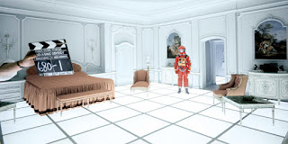
Further emphasise on the distant nature of man is suggested by the use of uninviting camera angles. This can be evidenced in Fig. 1 as we see the protagonist in the mid-ground. Kubrick has chosen to place him there instead of closer up making it appear that the audience is peering from outside, isolated from the character. The use of clever shots is used throughout the film as Kubrick strategically places them to enhance the visual aspect of ‘2001: A Space Odyssey’.

(fig.2)
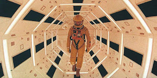
Kubrick uses The Rule of Thirds to great effect when composing his shots using it to draw the viewer’s attention to certain aspects of the screen.  This is assisted by the use of one point shots with a large amount of symmetry being favored by Kubrick. Looking at Fig. 2 we can see that the one point shot draws all attention towards the figure. The symmetrical nature of the chamber creates a single point of focus as the lines all merge towards the middle of the screen.

(fig.3)
Not only does the film achieve an amazing picture but the sound design and score alone are capable of setting a grand atmosphere. As Chris Jones states, “the grandeur of the planetary alignment which heralds the ''Main Title''; but to hear it alone still stirs emotion” (Jones, 2002). The timing between the sound and footage is astounding as the music jolts to a sudden stop at the height of tension or slowly build up to create an epic moment. At the same time the lack of sound proved just as powerful as the audience is strained by the cold silence with the distressful actions no longer masked by a musical score. Some notable sound designs include the use of silent space a first for its time and the heavy breathing of the crew. The obnoxious inhaling and exhaling puts emphasis on man’s position in space and thus his vulnerability without his technology.   

Unexpectedly one of the most iconic characters, the computer HAL 9000, which guides the crew through space, raised many questions through its interaction with humans. Described as the sixth member of the crew by the conscious men, it is only more chilling when he is dispatched by one of those he was charged with protecting. Following the reoccurring theme of slow pace Bowman removes HAL’s vital components one by one rendering the “sixth crew member” into the equivalent of an electronic vegetable. To an extent Bowman has become more cold and calculated than HAL itself doing all that it will take to survive. This leaves HAL as “the film’s most unexpectedly sympathetic character” (Kermode, 2014) as it slowly recalls its earliest memories before winding down to a halt.

This brings on the next point to Kubrick’s film. It is apparent the Kubrick has chosen to leave the ending open to viewers to decipher alongside the large amount of symbolism as little is explained. One interpretation of the film is that man-kind has only been able to advance through the use of tools witnessed within the first scenes; additionally man-kind has not been able to advance without the need to destroy. Another is that man-kind has been allowed to advance beyond their physical selves.

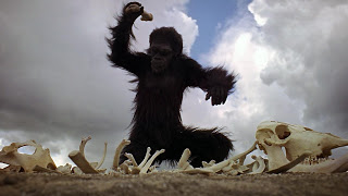
(fig.4) early man discovering how to utilise a weapon

Ultimately ‘2001: A Space Odyssey’ is a breath-taking film with powerful imagery that leaves the answers in the hands of the audience, free to interpret the story how they like. One rather alarming insight to be taken from this film is that man had learnt how to kill before he had learnt to make fire.

Biblography

Mark Kermode (2014)
2001: A Space Odyssey review – Stanley Kubrick’s sci-fi epic back on the big screen
https://www.theguardian.com/film/2014/nov/30/2001-a-space-odyssey-kubrick-sci-fi-epic-back-big-screen

Chris Jones (2002)
Original Soundtrack 2001: A Space Odyssey Review
http://www.bbc.co.uk/music/reviews/dnvr/

Roger Ebert (1968)
2001: A SPACE ODYSSEY
http://www.rogerebert.com/reviews/2001-a-space-odyssey-1968

Illustration list

fig.1 https://pbs.twimg.com/media/Bx_Lcw9CcAAThrs.jpg
fig.2 http://bloggingmoviesrus.blogspot.co.uk/2015/03/2001-spacey-analysis.html
fig.3 https://consumedbyfilm.files.wordpress.com/2014/02/2001-a-space-odyssey-bowman.png
fig.4 http://2.bp.blogspot.com/-64Ao0nbk8NY/UUXf0Y5WfBI/AAAAAAAAJIM/uSUMHk6ovYI/s320/2001+a+space+odyssey2.jpg

Life drawings no.4


Tuesday 11 October 2016

Argia Composition experiment/ Colour composition

Experimenting with the composition of the underground city. This set up composes of a chain of mining towers within a small crevice rather than a large one. From this angle smaller paths can be seen on either side which are lit by lamps. Supporting ropes on anchors are reaching outwards across the cavern. Thanks to Simon for suggesting bounce below


The next view that over looks the city is taken from a lower angle along one of the paths along the cavern. These two compositions overlook the city from a distance making it possible to view the multiple towers that are linked together. Colour is yet to be added to this thumbnail.


The styles chosen have been looked over briefly going over the type of mining tower with super structure surrounding it. After some consideration it has been decided that the towers will consist of a multitude of main floors and several smaller ones all connected by bridges allowing access to the other towers.


Saturday 8 October 2016

Animation artists Don Herzfeldt and Lotte Reinger Review

Don Herzfeldt

(Fig. 1) Don Herzfeldt

Born on August 1st, 1976 in Alameda County, California Don Herzfeldt has been noted for creating a number of independent influential films. Some of these films include: It's Such a Beautiful Day, World of Tomorrow and The Meaning of Life.
It was at a young age Herzfeldt started animation using a camera but found that the film was too expensive. As a result he quickly changed to using hand drawn frames that are now used as his main form medium today. It is the choice of traditional methods of animation that have made him, as an animator, stand out finding new animation techniques upon the principles of the old ones.
Herzfeldt quoted, “We have over 100 years now of amazing film technology to play with, I don't understand why any artists would want to throw any of their tools out of the box” (New York Times 2008). Herzfeldt strongly believes that it is not how an image is captured but the end result that truly matters in his art.

(Fig.2) Scene from "Rejected Cartoons"

Despite being limited in resources from a young age Herzfeldt has managed to create animation capable of capturing the audience’s attention. The simplistic hand drawn characters allow his dark humour to be conveyed without causing too much controversy. It is the use of a simple art style that makes it easy to enjoy. Alongside being easy to enjoy it shows an achievement to aspire to despite any animator’s background and material available.  

Lotte Reinger

(Fig. 3) Lotte Reiniger

Lotte Reiniger was born on the 2nd of June 1899 to a German family. From a young age she became interested in the concept of using silhouette puppets inspired by those used in Chinese art. It was later in life when she was introduced to cinema seeing films created by Georges Méliès. From here Reiniger delved further into the possibilities of animation.


(Fig. 4) Still from Reiniger's film Däumelinchen
    1. (Fig. 5) Example of shadow puppet in use

During Reiniger’s lifetime she was able to produce over 40 films using her own creations. The style of animation shown can be compared to puppets as cut outs of silhouettes are manipulated to form frames. Due to the nature of early cameras most of the films feature black and white film reminiscent of shadow puppets. Despite looking on from a 2D side view the work create has a warm fairy tale feel, the feeling of nostalgia is only increased with the stories portrayed sometimes being selected from such stories like “Puss in Boots”. 


Illustration List

Fig.1 http://www.denofgeek.us/sites/denofgeekus/files/3/06/don_hertzfeldt.jpg
Fig.2 https://s-media-cache-ak0.pinimg.com/236x/ab/49/c1/ab49c1bfb2e099a4ea12d3daba1c77ab.jpg
Fig.3 http://www.animationresources.org/pics/achmedreiniger.jpg
Fig.4 https://europeananimation.files.wordpress.com/2014/09/lotte_thumbelina_1954.jpg
Fig.5 https://s-media-cache-ak0.pinimg.com/originals/f2/c4/4c/f2c44ce5add4726356349d6456474835.jpg

Friday 7 October 2016

Flash Bouncing Balls


Maya Exercises

This exercise features multiple types of shaders simulating various materials from real life which were placed over a scene provided for the class.

Matte


Plastic


Metal


Blue Chrome


Gold


Glass


Glowing material


UV exercise with toy boxes


Lighting exercise